Stakeholder Engagement
|
Graphic Design
|
Photo & Video Direction
|
Brand Development & Design
|
Website Development & Design
|
Brand Roll Out
|
Digital Media Marketing
|
Email Marketing
|
Stakeholder Engagement | Graphic Design | Photo & Video Direction | Brand Development & Design | Website Development & Design | Brand Roll Out | Digital Media Marketing | Email Marketing |

MOORE
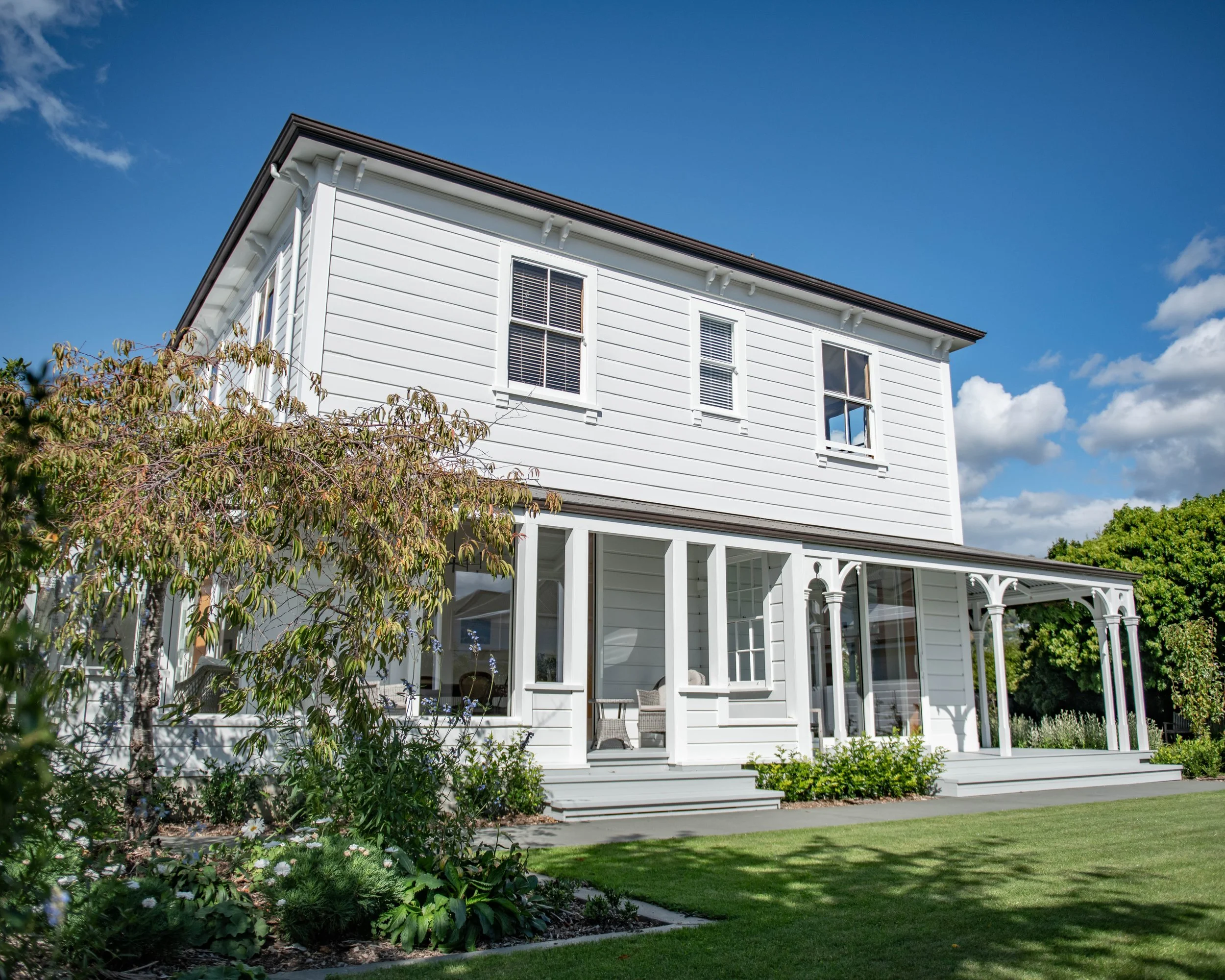
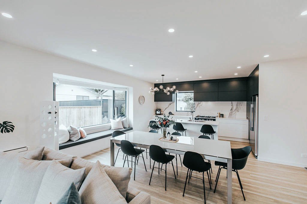
After 10 years in business, passion still runs deep for this Nelson based building, engineering and design firm.
It was evident when we met with Connie and Craig from MOORE (then C Moore Building) that there was something genuinely refreshing about this couple. A talented duo, they had grown their business to over twenty staff over the years and have an impressive array of projects under their belts.
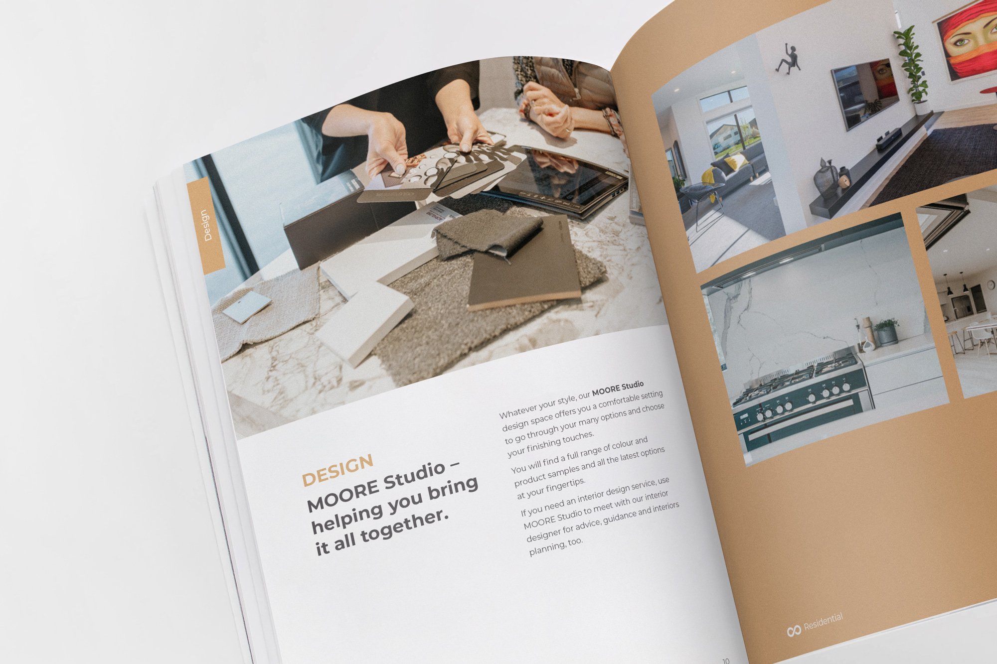
With the addition of an engineering division, their interior design offering taking hold, recognition of their market landscape and the desire to keep moving forward, they decided it was time for a fresh look to reflect who they are today. Cue, Publik.


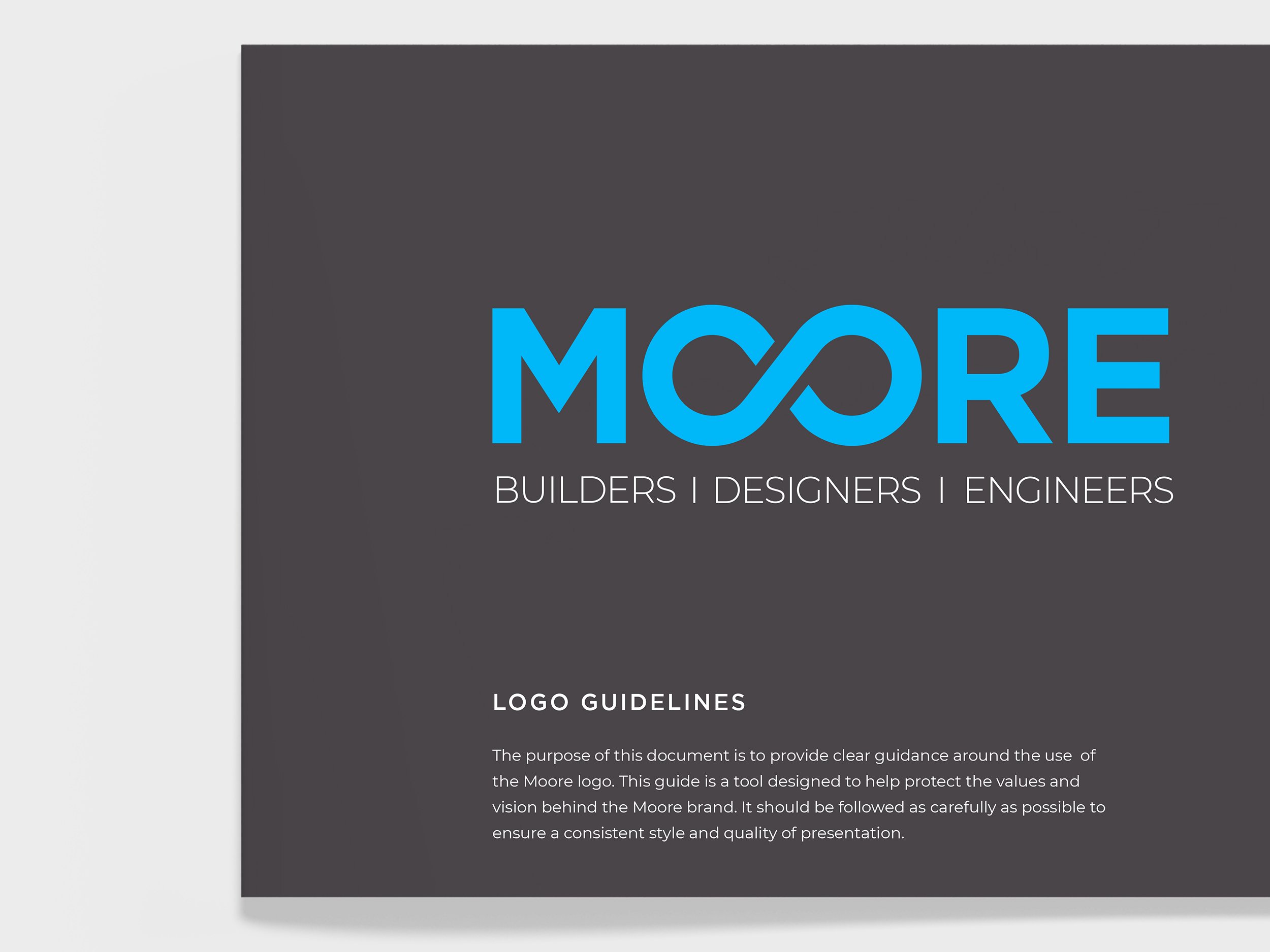

Logo and visual identity
It became evident that there was ‘moore’ (couldn’t help ourselves) than meets the eye with MOORE. There was strength in what they had built and it was important to honour and leverage that quality.
The simplified logo felt fitting. It helps show sophistication and professionalism while communicating ‘established’ and ‘trustworthy.’ It helps ensure that the fact they are down to earth and approachable is not clouded by overcomplicated design.
The name (and how it is visually represented) is a strong nod to the established brand Craig and Connie have created and its existing positioning in the market. It becomes an important link to the brand’s founders and a platform for the future to set MOORE apart from competitors in their space.
As part of this process, a wider palette was developed to add depth to the design – and while the original brand blue is maintained, its treatment is different.
The O’s in the name MOORE join together to create a graphic device that is a flat modern ‘infinity-like’ symbol – almost like a chain link, or two Cs coming together. The infinity symbol is widely recognised, as is its meaning and the immediate subliminal message this shares with viewers.
It is a symbol of love and helps metaphorically show it is a brand you can love. It brings warmth, approachability and care to visual messaging. Quality is important in consumer decision-making. Quality in building is longevity, being ‘unbreakable’, and beauty and aesthetics (among other things) – all represented by this symbol. It also reminds us to be conscious of where we are and the endless possibilities we have before us. The logo and its application communicates that MOORE is approachable, helpful and friendly, as well as professional, trustworthy and caring.
Visuals like this (as well as colours and fonts) can help tell a significant part of your brand story at a cognitive level the consumer is not aware of.


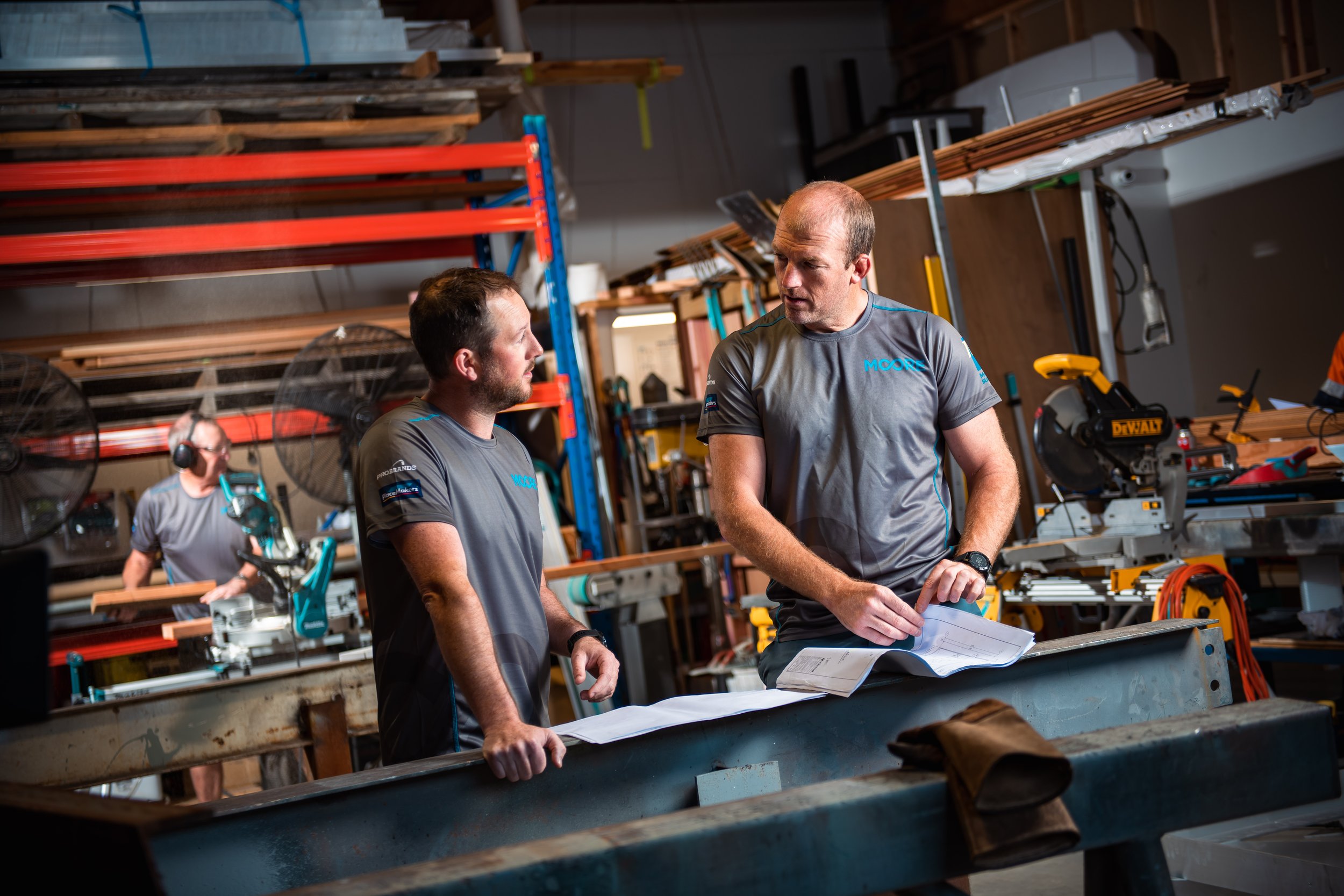


People, people, people
We recognise the value the human element of a brand can give a business. For the MOORE brand, people were at their heart – be it their clients, their staff, or their subbies.
It was important to tell this narrative as part of their brand, to show the team, and to have people wherever possible in brand imagery and videography.
This is also a theme strongly identified though all marketing copy developed as part of this process.


Whatever it is, the way you tell your story can make all the difference.